
In the fast-paced digital landscape where first impressions are made in mere seconds, your website is often the frontline of communication between you and your audience.
Imagine walking into a beautifully designed store that draws you in with its inviting atmosphere, sleek displays, and intuitive layout—this is what a well-crafted website can achieve for your brand online. However, many businesses still rely on outdated designs or cluttered interfaces that leave visitors confused rather than captivated.
If you’re ready to elevate your online presence and transform casual browsers into loyal customers, understanding effective design principles is essential. In this article, we’ll unveil ten proven strategies that can revolutionize your web design approach.
From harnessing the power of color psychology to optimizing user experience through seamless navigation, these principles will not only enhance aesthetics but also improve functionality and engagement. Join us as we explore how these transformative techniques can make your website not just a destination but an experience!
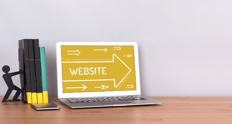
Transform Your Website Today
In today’s digital landscape, your website serves as the virtual front door to your brand, and first impressions matter more than ever. To truly captivate visitors, consider integrating immersive design elements that resonate emotionally with your audience.
For example, using personalized content tailored to user behavior not only boosts engagement but also fosters a sense of connection—transforming casual browsers into loyal customers.
Moreover, embracing a mobile-first approach is no longer optional; it’s essential. As more users browse on smartphones than desktops, ensuring a seamless experience across all devices will elevate your site’s functionality and retention rates.
Consider experimenting with dynamic layouts or animations that enhance usability while guiding users through their journey effortlessly. By prioritizing both aesthetic appeal and intentional navigation flows, you’re not just making changes—you’re redefining the very essence of how visitors interact with your brand online.
Understand Your Audience’s Needs
To create a website that resonates with your audience, it’s essential to delve deep into their needs and motivations. Conducting surveys and interviews can provide invaluable insight into their priorities, preferences, and pain points.
For instance, understanding the age demographics of your users may reveal whether they favor bold visuals or minimalist layouts. It’s not just about what you think is appealing; it’s about strategically tailoring content that speaks directly to them.
Additionally, leverage analytics tools to assess user behavior on your site. Observing which pages retain visitors the longest or where they drop off can guide you in refining design elements for improved engagement. This data-driven approach enables you to anticipate user expectations—whether they seek quick access to information or immersive multimedia experiences—and positively influences how they interact with your brand overall. By putting yourself in their shoes and continually adapting based on feedback and metrics, you not only enhance user experience but build lasting loyalty as well.
User-friendly navigation is the backbone of a successful website, providing visitors with seamless access to information and enhancing their overall experience. Imagine landing on a site where every click feels intuitive; this sense of ease not only encourages users to explore further but also builds trust and loyalty.
By prioritizing straightforward menus and clearly defined categories, you create an environment where users can quickly find what they’re looking for, transforming potential friction into fluidity.
To achieve this, consider the hierarchy of your content. Implementing breadcrumb navigation allows users to trace their steps back effortlessly while offering contextual cues on their current location within the site—a subtle yet effective way to engage your audience more deeply.
Additionally, responsive designs should provide consistent usability across devices; whether on desktop or mobile, optimal navigation must meet user needs without requiring them to zoom in or scroll excessively. Regularly analyzing user behavior through analytics tools can reveal pain points in your existing structure, enabling you to refine and enhance the journey continuously.
Incorporating visual cues like icons or highlighted buttons can further guide users along their path, making interactions feel even more natural.
Remember that each aspect of navigation should work harmoniously together—minimizing choices when necessary helps avoid overwhelming visitors and fosters higher conversion rates by leading them toward desired actions effortlessly.
Prioritizing user-friendly navigation isn’t just about mechanics; it’s about crafting memorable experiences that resonate long after they leave your site.
Embrace Responsive Web Design
Responsive Web Design (RWD) is not just a trend; it’s an essential strategy for ensuring your website thrives in a multi-device world. By creating fluid grids and flexible images, RWD transforms how users interact with your content across desktops, tablets, and mobile devices.
This approach doesn’t merely adapt the site’s layout; it provides tailored user experiences that cater to different screen sizes and capabilities. Think about it: a seamless experience fosters deeper engagement, encouraging visitors to explore more of what you offer.
Moreover, embracing responsive design enhances your SEO efforts. Search engines strive to deliver optimal user experiences, rewarding sites that adapt gracefully to any device with higher rankings.
Additionally, with the ongoing rise of voice search and smart assistants, having a responsive site allows your content to be accessible in various formats—whether through spoken queries or visual prompts on smaller screens. This adaptability not only future-proofs your website but also positions you as a forward-thinking brand ready to meet evolving consumer behaviors head-on.
Optimize Loading Times for Performance
One of the most critical aspects of user experience is loading time; a website that takes too long to load can frustrate visitors and lead to high bounce rates. To optimize loading times, consider employing techniques like lazy loading, which delays the loading of images and videos until they are about to enter the viewport.
This approach minimizes initial load times while enhancing performance—especially crucial for mobile users who often operate on limited bandwidth.
Additionally, leverage modern web technologies such as content delivery networks (CDNs) that distribute your site’s assets across multiple geographic locations. By caching content closer to your users, CDNs significantly reduce latency and improve load speeds.
Don’t overlook image optimization: using formats like WebP or tools that automatically compress file sizes without sacrificing quality can dramatically streamline your site’s performance while ensuring visual appeal remains intact.
Balancing aesthetics with efficiency not only keeps visitors engaged but also improves search engine rankings—a win-win for any digital presence eager to leave a mark in today’s fast-paced online landscape.
Use Consistent Branding and Typography
Consistent branding and typography are crucial elements that breathe life into your website, ensuring it resonates with visitors on a deeper level. When your brand identity—unifying colors, logos, and fonts—is applied consistently across every page, it cultivates trust and familiarity among users.
This visual cohesion not only enhances the aesthetic appeal of your site but also reinforces your brand’s personality, making it more memorable in a saturated digital landscape.
Using typography strategically can elevate user experience as well. The right font choices not only reflect the tone of your content but also guide the reader’s eye through complex information.
For instance, integrating hierarchical text styles—like headings and subheadings—with adequate spacing can make even dense topics feel approachable and engaging.
Consider exploring unique typefaces that align with your brand ethos while ensuring readability; this clever balance will keep users captivated rather than overwhelmed.
Ultimately, consistency in branding paired with thoughtful typography transforms not just how users perceive content but how they interact with it—leading to longer visits and meaningful engagement on your site.
Incorporate High-Quality Visuals and Media
Incorporating high-quality visuals and media into your website design isn’t just about making it look good; it’s a strategy that can significantly enhance user experience and engagement. When users encounter clear, compelling images and videos, they are not only drawn in but also are more likely to absorb the content presented.
A powerful visual can convey emotions, tell stories, and reinforce messages far more effectively than text alone. Consider using authentic photos that resonate with your brand’s narrative or well-produced video snippets that captivate attention within moments.
Moreover, integrating multimedia elements should be purposeful rather than decorative. Think of infographics or interactive graphics that allow users to engage more deeply with the subject matter they’re exploring.
This not only boosts comprehension but also promotes sharing on social media platforms—expanding your reach organically. Another innovative approach is incorporating animation: subtle movements can guide visitors through sections of your site and create a dynamic browsing experience that feels alive.
Elevate your design by thoughtfully melding aesthetics with functionality; when visuals complement the narrative seamlessly, they transform mere visitors into loyal followers eager for more.
Ensure Accessibility for All Users
Accessibility is not just a compliance checkbox; it’s a fundamental aspect of design that can enrich user experience for everyone. By adopting an inclusive mindset, you open doors to creativity and innovation.
Consider the diverse needs of your audience—disabilities are not limited to visual impairments but also include auditory challenges, cognitive variations, and motor difficulties.
Implementing features such as alt text for images, keyboard navigation options, and sufficient color contrast creates a seamless experience that invites users to engage more fully with your content.
Moreover, accessibility fosters a sense of community among users. When everyone has equal access to information and services online, it cultivates loyalty and trust in your brand. Tools like screen readers or voice commands should be treated as essential components rather than afterthoughts.
By prioritizing these elements during the design phase, you position your website not just as another digital space but as an inviting haven where all individuals feel valued and included—ensuring their unique perspectives contribute significantly to the narrative you wish to share.
Implement Effective Call-to-Actions
A well-crafted call-to-action (CTA) serves as the bridge between passive visitors and active participants on your website. To create an effective CTA, it’s essential to leverage urgency and clarity; incorporating phrases like “Limited Time Offer” or “Join Now for Exclusive Access” can ignite a sense of urgency that propels users into action. Experimenting with colors, sizes, and placements is crucial—sometimes a bold button in a contrasting color can catch the eye where bland text fails.
Additionally, personalization plays a pivotal role in enhancing engagement. By tailoring CTAs to different segments of your audience based on their behavior or preferences, you can make each visitor feel understood and valued.
For example, if someone is revisiting your site after previously exploring specific products, customizing CTAs like Complete Your Purchase not only reminds them of their interest but also encourages completion of the desired action.
Ultimately, when you combine clear messaging with strategic design elements tailored to user behavior, you create compelling pathways that lead visitors seamlessly toward conversion.
Test and Iterate for Continuous Improvement
Embracing a test-and-iterate approach in your website design isn’t just about refining aesthetics; it’s about fostering a dynamic relationship with your users. Each iteration serves as an opportunity to delve deeper into user behavior, revealing insights that can transform the ordinary into the extraordinary.
By leveraging analytics and user feedback, you can identify patterns and pain points that may go unnoticed in static designs. This process not only enhances user experience but also cultivates an environment of innovation where ideas can flourish.
Continuous improvement isn’t merely an exercise in updates; it’s a philosophy rooted in adaptability and responsiveness. Consider employing A/B testing as a tool to compare different design elements and gauge their performance against specific metrics like engagement rates or conversion funnels.
This data-driven approach allows for informed decision-making, shifting focus from assumptions to evidence-based strategies. As each cycle of testing brings clarity, it creates the perfect framework for creating a website that resonates more deeply with your audience – evolving alongside their needs and preferences as they change over time.
Conclusion: Elevate Your Website Experience
In the increasingly competitive digital landscape, elevating your website experience is not just a luxury—it’s a necessity. Each design principle we’ve explored offers a powerful tool to enhance user engagement and ultimately drive conversions.
By prioritizing intuitive navigation, responsive design, and compelling visuals, you create an inviting atmosphere that encourages visitors to linger longer on your pages. But don’t stop there; leverage analytics to understand user behavior and continually iterate based on real data.
Moreover, consider the emotional connection you’re cultivating through your website’s aesthetics and content. Simple choices—like color schemes or typography—can significantly impact how users feel about your brand.
Embrace storytelling in your design; every element can narrate your unique value proposition. When users not only see but also feel connected to what you offer, they are more likely to share their experience with others—transforming casual browsers into loyal advocates for your brand.
As you implement these principles, remember: transforming a website is an ongoing journey of connection and innovation that directly influences how visitors perceive and interact with your business.


